
So I have been re-reading the state of DevOps report (https://puppetlabs.com/2015-devops-report ) recently on the plane to my project and found a few interesting aspects that are worth highlighting – especially as they are matching my experience as well. It shows a much more balanced view than the more common unicorn-approach to DevOps.
First of all – I am glad that the important of deployments is highlighted. To me this is the core practice of DevOps, without reliable and fast deployments all the other practices are not effective, whether that is Test Automation or Environment provisioning. So this part from the report clearly is one of my favourites:
“Deployment pain can tell you a lot about your IT performance. Do you want to know how your team is doing? All you have to do is ask one simple question: “How painful are deployments?” We found that where code deployments are most painful, you’ll find the poorest IT performance, organizational performance and culture.” – Page 5
And there is a whole page discussing this aspect on page 26, but here the summary steps to take:
- Do smaller deployments more frequently (i.e., decrease batch sizes).
- Automate more of the deployment steps.
- Treat your infrastructure as code, using a standard configuration management tool.
- Implement version control for all production artifacts.
- Implement automated testing for code and environments.
- Create common build mechanisms to build dev, test and production environments.
And even the speed to market with around 50% having more than a month of lead time to production feels about right (Page 11)
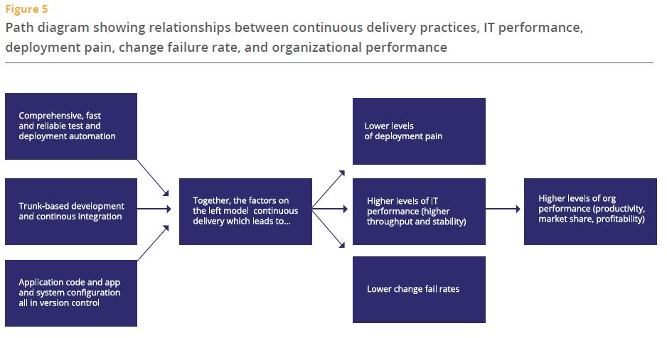
The two models on page 14 and 15 are quite good, there is not much new in this, but the choice of elements I think speaks to changes in the DevOps discussion that I have seen over the last 18 months and which I see on my projects too – and it highlights visualisation of data as one key ingredient. It’s such an important one, yet the one that not many spend their energy (and money) on. Probably because there is no obvious and easy tool choice (CapitalOne for example developed their own custom dashboard – https://github.com/capitalone/Hygieia & http://thenewstack.io/capital-one-out-to-display-its-geekdom-with-open-source-devops-dashboard/ ). The report goes on to advice “Turn data into actionable, visible information that provides teams with feedback on key quality, performance, and productivity metrics” – Amen.
Here are the two models from the report:

And of course based on my recent discussion about DevOps for Systems of Record (Link here) I was glad to see the following statement in the report:
“It doesn’t matter if your apps are greenfield, brownfield or legacy — as long as they are architected with testability and deployability in mind, high performance is achievable. We were surprised to find that the type of system — whether it was a system of engagement or a system of record, packaged or custom, legacy or greenfield — is not significant. Continuous delivery can be applied to any system, provided it is architected correctly.” – Page 5
Overall I think this report is really useful and represents what I see in my projects and at my clients very well. It also discusses the kind of investments required to really move forward (page 25) and provides guidance on many aspects of the DevOps journey. I am looking forward to see what the next year will bring.
