In this week’s post I will talk about a topic close to my heart. How do you manage Agile projects if you have some scale. And especially how do you report on progress and use the lessons from your projects effectively across the enterprise? Let’s start by looking at what we want to get out of the reporting.
What should a good report show you:
- How has the scope changed over time?
- How much scope have we successfully completed?
- How is the team progressing towards the goal over time?
- How are we doing with cost?
- How is this team progressing compared to other teams?
- Which teams should I help to get them back on track?
So here is the first example of a “traditional” Agile release burn-up that gives us information for points 1-3: So how do you read this report? The first line shows how the target scope developed over time. In this case you can see that the number of story points required moved a bit up and down as stories were delivered. This is pretty normal for an agile project, nothing to worry here. We have an ideal line to show us what the “ideal” amount of accepted story points would be, of course no team ever delivers according to this line. If they do, I would ask a few questions as it just looks too good to be true – perhaps we bend the truth a bit in those cases to not explain the difference…
The actual burn-up and the predictions that the team tracks let me to the conclusion that this will be close, but that they can make it. This is a team I will keep an eye on going forward to see whether they catch-up as predicted. As the overall trend of total scope is also slightly downwards, there is a chance that the trend continues to a number even below 911 story points, which would be good for this team.
Challenges with Agile reporting (points 4 & 5)
If you are like me and are working in an enterprise environment it is likely that your teams use different iteration schedules, don’t have an aligned story point structure and are of different size. If you look at the release burn-up graphs, you can hardly compare them and by looking at many across the enterprise you don’t necessarily are able to compare their progress. Here is where my favourite report comes in – the relative burn-up that answers point 5 from our list of requirements.
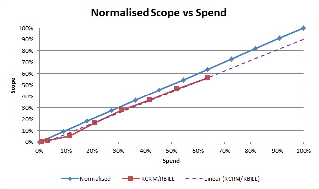 The beauty is that you can show all kinds of things on this graph. In the example shown here, we track the progress of accepted scope against the budget (point 4) that we have used (and yes we are falling behind, looks like we need more budget to deliver our scope). Of course you can do the same for scope vs. schedule. And because these reports are relative to 100% of scope, budget or schedule you can now compare your status reports across teams. We are all aware that status is not linear and that the ideal line is mostly to be ignored, but if after the release has finished you look back at the teams that were successful and those that had challenges you can look for patterns. What percentage of scope did successful teams delivery after 50% of their schedule? How much budget did they have left after they completed 90% of the scope? Through this insight you can develop a portfolio view that I describe later.
One of the biggest challenges: How accurate is the data
Before I do that I want to share one more challenge: Real-Time data. It is near impossible in my experience to get good reporting if you have to manually collate the data and/or the report is purely used for outside stakeholders. To make your reporting effective you should explore ways to make the report automatic based on data that your team already provides rather than making it a separate activity. And to avoid the challenge of stale data, make it part of your stand-up to look at the report; this will help keeping people motivated to update their data. Ideally in any status meetings you have you and your stakeholders look at the tool you use and not extracts, excel sheets or PowerPoint slides; but I have not seen many organisations doing this successfully.
And now to the promised portfolio view (point 6):
How to keep track of many projects or teams in your organisation? In the manual for Agile it says that you should get your status by attending stand-ups. How do you do that if you have 20 teams working at the same time? I think we all understand that some kind of reporting will be required and as long as it is helpful and used for the right purpose (to provide help where required, not to call teams out where they struggle) we all want that kind of visibility. If you have the relative reporting in place that I mentioned above, you can now use this to get a good view of your teams and you can chart your learning from the past into the report. It could look like this (this is still conceptual as I have not yet implemented it on my program):

If you use the relative burn-ups you can now draw each of the teams on portfolio map like the above. Depending on how far they are through their scheduled iterations and how much scope has been accepted you position them on this map. From your experience with successful and challenged teams you know which area is green, amber and red (this will differ from organisation to organisation). But now you can quickly see for which teams it is worthwhile to look at them a bit closer. In the above example the size of the team (size of bubble) and the planned release date (colour) are also shown. As enterprise coach I would talk to the team represented by the large red bubble at 50% of schedule and the small red bubble at 85% of their schedule. At this point you will have to understand the context of these teams to see whether they need help or not. This diagram makes watermelon status (appearing green from the outside but really being red) less likely as it is purely based on the agile burn-up information and your experiences in the organisation. I will let you know how well this works once I have implemented it successfully.
Now this is one aspect of reporting done (status), I will talk about how to report on delivery health in the next post, where we will talk about a delivery health score card and cumulative flow diagrams. As always reach out if you have thoughts or perhaps even good examples.
